Dutch consumers favour British traffic light model for food information
- Like
- Digg
- Del
- Tumblr
- VKontakte
- Buffer
- Love This
- Odnoklassniki
- Meneame
- Blogger
- Amazon
- Yahoo Mail
- Gmail
- AOL
- Newsvine
- HackerNews
- Evernote
- MySpace
- Mail.ru
- Viadeo
- Line
- Comments
- Yummly
- SMS
- Viber
- Telegram
- Subscribe
- Skype
- Facebook Messenger
- Kakao
- LiveJournal
- Yammer
- Edgar
- Fintel
- Mix
- Instapaper
- Copy Link
Posted: 16 April 2018 | George Smith (New Food) | No comments yet
The traffic light system was favoured over the French and Scandinavian schemes.
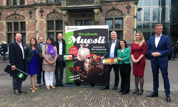
GREEN LIGHT: Consumentenbond representatives with the options of food information systems
Dutch consumers have shown a preference for the British traffic light system to help them make better informed choices when it comes to food.
Nearly three quarters (71 per cent) of the 1000 respondents to a survey conducted by the consumer group Consumentenbond (Consumer Association) were in favour of the introduction of a food choice logo on the front of packaging.
Bart Combée, President of the group, said: “Consumers have a clear preference for a food choice logo that works with traffic light colours.
“We therefore want the Government to work on this quickly. Consumers want clear information on the front of packaging, with which they can see at a glance how healthy or unhealthy a product is.”
Consumenten bond asked people for their opinion on three food choice logos: the British traffic light system, France’s Nutri-Score and the Scandinavian keyhole logo.
The respondents were most positive about the traffic light system and Nutri Score, both of which work with traffic light colours. Fifty one per cent would opt for the traffic light logo, 29 per cent for Nutri-Score and 8 per cnet for the keyhole logo. The respondents also said that a new food choice logo must meet a number of conditions:
- Introduced by an independent body.
- All manufacturers and supermarkets participate.
- Indication on all products, not just healthy ones.
Previously, Dutch food manufacturers have used the ‘tick’, or vinkje, to mark out healthier food but the system has seen a great deal of criticism.
Mr Combée added: “The Consumers ‘ Union successfully fought against the Vinkje on food packaging, because it was incomprehensible for consumers . Moreover, products with a check mark were not always a healthier or conscious choice. It is now high time for a balanced and understandable food choice logo. That would also be a nice counterpart to all claims and other sales pitch from manufacturers on packaging, which often obscure high levels of sugar, salt and fat.”
According to the consumer group, a food choice logo is necessary because hidden sugar, saturated fat and salt can lead to cardiovascular diseases, kidney damage and diabetes.
Related topics
Free From, Health & Nutrition, Packaging & Labelling, The consumer